Can you remember the first time you set out to build your photography website? Let’s be honest, building a simple website is stupidly difficult. The sheer volume of tear-shedding failures and hair-pulling frustrations are vastly disproportional to any other photography task. And if you’re like most photographers, the reason you persisted and endured is because you were fueled by an underlying assumption that once you got this website going, Google would generously send you visitors and the universe would magically convert them into paying clients.
But once you launched your website, your presuppositions were quickly disillusioned as you discovered that the link between creating a website, attracting visitors, and conversion, was not directly correlated.
It’s no secret that most consumers today are transitioning to buying online, but for some reason, photographers have struggled to benefit from this transition. As a result, most photographer websites have continued to function purely on the level of showcasing a portfolio. For example, simply browsing through photography templates on Squarespace, the most popular website builder for photographers, you’ll quickly observe that nearly every template is designed primarily, and dare I say purely, around a portfolio presentation.
While using your website to showcase your work is great, most likely you’re not a museum or offering stock photography. You offer a photography service and your goal is to grow your business by generating new bookings. So what is your strategy for converting your website visitors into paying clients?
1. Beautiful is the new standard.
Good web design is the new consumer expectation for building trust. Subconsciously, consumers decide if a product is worth the money depending on the quality of the website. Ugly simply doesn’t sell. This reality puts photographers in a real dilemma because being a good photographer doesn’t mean you’re automatically a good web designer.
Building a website is already an insane task, but single-handedly building a beautiful website that converts, is simply fantasyland. Many photographers look for builders with extensive customization and seek to design their own websites from scratch without experience or knowledge to what actually converts. Fortunately, there’s extensive research and science behind web conversion, but who has time to read all that? And how is a photographer supposed to be cutting-edge in all these diverse disciplines?
The goal of Picr is to help photographers grow their business, so here is how we are aiming to solve this. We have created photography templates which are designed specifically for conversion. Furthermore, we employ the best web designers in the industry to create websites for you that are truly beautiful. While our Beta version is far from our vision for the website builder, we will continue to expand the builder to offer much more customization without compromising the quality of the templates. It’s a fine line to walk and we’re committed to it.
2. Five seconds is all you get.
Statistics show that a visitors first 5 seconds on your website are most critical. Most people who abandon a website, leave during this time. If you’re not able to make a good impression on new visitors, you can safely assume that most of them will bounce.
Practically, this means that the first several images your visitors see should be your absolute best work. The kind of work you display is directly correlated to the kind of clients you will attract.
Second, without being too wordy, your website should be explicit about what kind of photography you offer, where you are based, and what you expect your visitors to do. Most visitors won’t stick around and read extensive copy. If you check your Google Analytics, you’ll see that most of your visitors don’t spend very much time on your website.
3. Good buttons are life and death.
This is absolutely critical to a conversion strategy. Large corporations spend great resources researching and testing which CTAs to use and where. Did you know that when Amazon introduced their 1-Click Purchase button, they increased their sales in the billions of dollars?
Your website should make it abundantly clear what exactly you expect your visitors to do next. What is the action you want them to take? Don’t give them many options. Just find the best option and make it as clear and simple as possible. If you expect them to fill out a contact form, make sure that it is more than obvious on every page.
Many visitors who land on photography websites have no idea what to do. Consequently, they find you on Facebook or Instagram and initiate conversation because at least your Facebook page has a “Message” button.
4. Communication is more than a contact form.
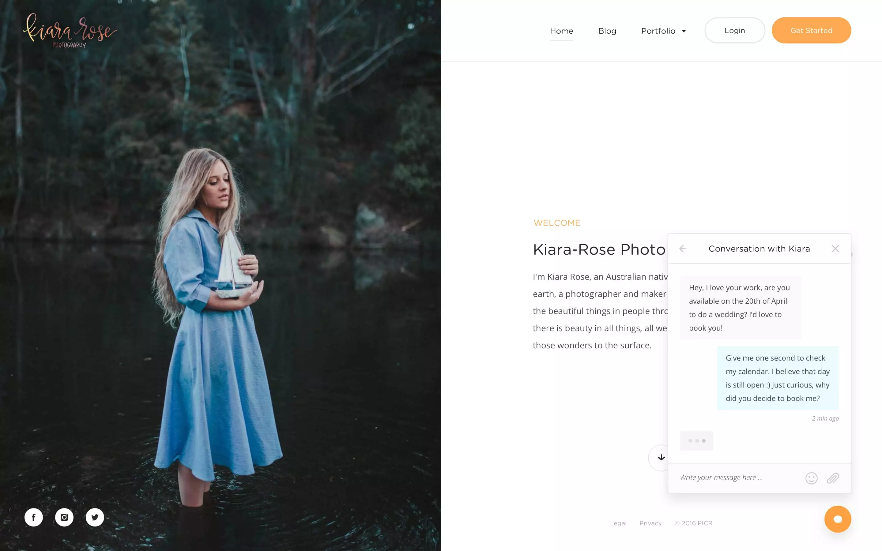
Most visitors on your website are not ready to make a purchase immediately. Chances are that they are shopping around and have questions for you before they’re ready to commit. A website that converts must not only facilitate contact but encourage conversation. As usual, it is best to use a mode of communication which is most familiar to the visitors. And honestly, filling out a contact form is one of the worst possible options. The only time your website visitors fill out contact forms like the one on your website, is when their appliance breaks and they’re trying to contact support at General Electric. The context is typically negative and there is little hope in a good reply. We have written more extensively on this topic earlier, be sure to read, The nightmare of contact forms and how Picr will fix it.
To tackle this issue, we have created a messenger which completely transforms your communication with your web visitors. First, the Messenger is built in the form of chat, which is most familiar to average consumers. It is far easier to engage someone in conversation using chat than email. Second, when someone engages in a conversation, they are required to provide their email which allows you to capture them as a Lead and continue to work with them in the future. Third, we have built mobile app support so that you can be sure to never miss an opportunity. You can reply to inquiries even on-the-go!
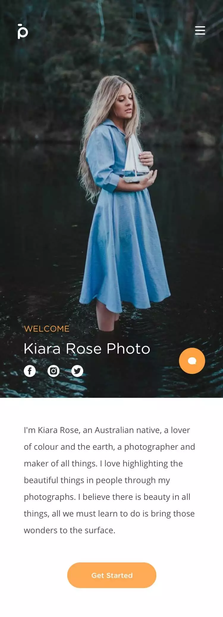
5. Mobile is not an option.
Several years ago something monumental occurred. For the first time in history, more people were browsing the internet from their phones than non-mobile devices, and this trend is not slowing down. Everyone knows that a website must be responsive to screen sizes, but having a website that converts on mobile devices requires more than just having the ability to browse your website. For a mobile experience to convert, your website navigation and design must accommodate the mobile environment. It’s a different way of designing because now the users are clicking with a finger and are probably on-the-move.
Considering the fact that more than 50% of web users are mobile means that we should now start with mobile design and make it accommodate the desktop sizes! Furthermore, mobile speeds are also typically slower, which presents a difficulty for photographers who’s websites are image-heavy. To ensure that your mobile experience is optimal, the mobile experience must be as light as possible and the images should not be any larger than the screen size requires.
Anything that does not lead to conversion or SEO should be removed. Many photography websites are cluttered and difficult to navigate. Remove any images or copy which is not refined and thoughtfully designed to convert. Every visitor to your website has limited attention, time and interest. You must, therefore, use every element strategically to convert.
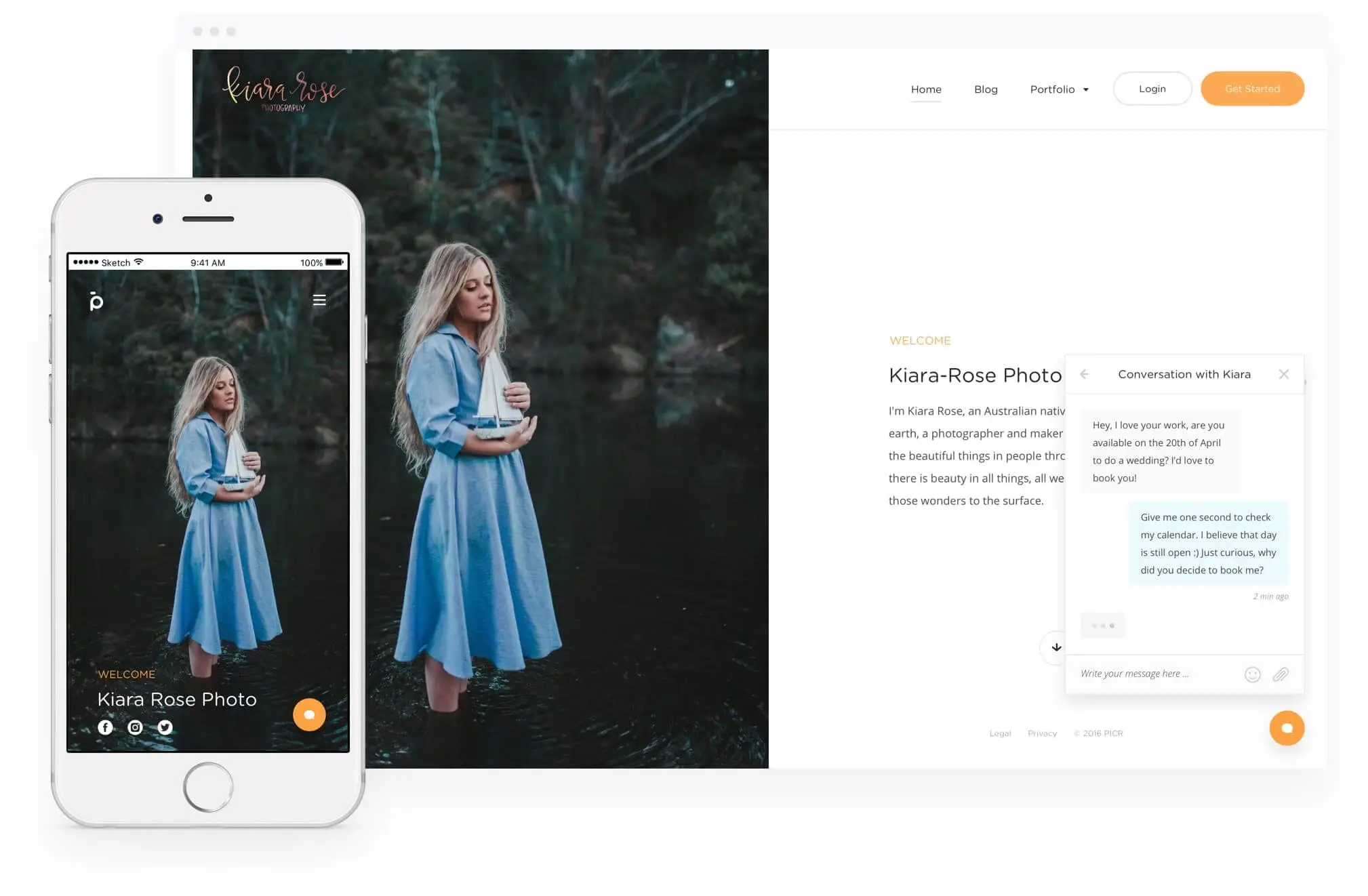
As an example, take a look at Kathleen’s website who built her website on Picr. Notice how you can immediately know what this website is about and what service she offers. You can also easily access her portfolio if you wanted to see more or her work. There is a message bubble at the bottom corner letting you know that she is open for conversation, and if you press the contact form, it engages the messenger. Finally, notice how the CTA is always visible, even in the portfolio.
What would you add to this list of imperatives for a photography website?